In trying to define my current practice, I managed to narrow it down to one core element that has bled into all of my Unit 6 work, the repurposing and recontextualising of old technology to create new meaning. I welcome you to join me on this adventure of discovery and reflection into my design inspirations, motivations and journey.


My current practice constantly finds me
Another way which I
In these two projects, I found myself going back and
Similarly to Lauzza’s work, my outcomes have relied on my audience having a certain level of knowledge about the digital world between 1997 and 2014. My work excessively plays into old digital design styles. Therefore, I would regard my current practice throughout Unit 6 as hyper-digital.
my journey w/ old technology 

So, the main way I would describe my practice is hyper-digital, frequently recontextualising
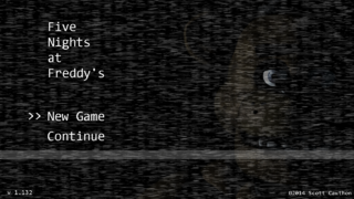
The vaporwave and lo-fi aesthetics had remnants of its visual language come to me through an unconventional form - analogue horror. The popular games Slender: The Eight Pages and Five Nights at Freddy’s came out in the early 2010s. I was fascinated by the concept that a video game could be horror. As a child, I was deathly afraid of anything in the horror genre. This fear made me hugely interested in the genre growing up, frequently revisiting these games and the analogue horror genre. Analogue horror’s style is one rooted in
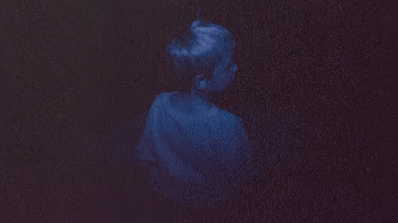
The intrigue I had into these games’ visual styles and concepts has definitely contributed to my current practice today. In my Unit 2 and Unit 3 Lens projects, I produced photography indicative of the analogue horror film, Skinamarink. To do so, I captured photos in dark settings purposefully to maximise the amount of digital noise visible. In these instances, I was using new technology in an unconventional and “inferior” way to evoke fear and have an

 Music and Music Videos
After the aforementioned Fortnite montage, I started taking Media Studies classes in Year 8 where I started to grasp a larger understanding of contemporary and historical media trends, specifically in the world of music videos. Looking back on it, 2020 is the first year I started actively thinking about the potential of old technologies in the modern day. ‘Gimme Love,’ a song by Joji, and ‘Supalonely,’ a song by BENEE, both made use of old digital cameras in their music videos. In Joji’s video, he makes use of this old technology to create an intimate, old aesthetic that compliments the fictional behind the scenes footage shown throughout his video. BENEE’s video makes use of “outdated” recording devices in order to play into the childish and fun imagery throughout, created using bright colours indicative of the vaporwave aesthetic. In both instances, this “outdated” technology created new meaning, and that has intrigued me ever since.
Many could describe these two music videos as Y2K mainly because of the use of old digital cameras and, specific to BENEE’s video, the use of bright colours and liminal settings. The Y2K term is rather broad though and encompasses many aesthetics. In my Unit 6 E&E project, I would have created some pages in the Y2K Futurism style if I had more time. For that reason, to properly contextualise it I think the Frutiger Aero aesthetic would be more aligned and specific to my work. For example, when I repurposed graphics from the Wii’s UI, my work instantly is indicative of Frutiger Aero because the Wii is a staple for the aesthetic, being mentioned 17 times on the Aesthetics Wiki’s Frutiger Aero page. Moreover, another page used photography representative of one of Frutiger Aero’s sub-genres’, Technozen. On a different page, I made use of Frutiger Metro design conventions that nod towards the design of Xbox’s Live Arcade console packaging, and Apple’s silhouette iPod advertisements. For those reasons, I would consider my Unit 6 zine an archive for two things. Firstly, it is an archive of various Frutiger Aero designs that have been recontextualised for a different purpose. Secondly, my zine had to convey the feelings which two songs create. To do that, I wanted to look outside of myself and build around comments left on the songs’ YouTube pages. In doing so I have also created an archive of this communities’ comments too. Andrea Lioy mentioned in Week 7’s lecture how we should design not for people, but with people - I feel like I have done that with my outcome.
Reigning it back into my own practice, seeing music videos like Joji’s ‘Gimme Love’ and BENEE’s ‘Supalonely’ in 2020, sparked a further interest into the Y2K aesthetic and how old technologies can be used to bring new meanings. This would eventually lead me to working with other old technological aesthetics such as Frutiger Aero today.
Another documentary which influenced my Unit 6 was Good Copy, Bad Copy. It is a 2007 documentary about copyright in the world of online file sharing, the internet and music. The film highlights many artists. The producer Danger Mouse gained popularity because of his project, The Grey Album. For this, he mixed vocals from Jay-Z’s The Black Album with The Beatles album commonly known as The White Album. In doing this, he created a piece of art which was completely new by recontextualising two others. Combining these two vastly different pieces of work required a lot of creativity and skill. This made me realise that authenticity is truly more important than originality, making me feel more confident about what I was creating in Unit 6.
In Good Copy, Bad Copy, the featured musicians remix a lot of other music to make new art through sampling. Many artists take parts of other songs and repurpose them to create entirely new music. Sampling is a practice I would never shun a musician for doing; therefore, it did not make sense that I had doubts about myself as a designer for doing something similar.
Thanks to both of the documentaries, I have taken a different attitude towards my work. Instead of viewing my hyper-digital and context-reliant work as lazy or bad, I now see it as me remixing and recontextualising visuals or design styles to create new meanings.


I think what also drew me to these styles is my upbringing. For example, I was drawn towards Lauzza’s work because the worlds in his music videos are heavily indicative of digital worlds rampant in my childhood. Similarly, I was drawn to Joji and BENEE’s use of old digital cameras because my father filmed so many cherished family moments using them. Analogue horror and the accompanying aesthetics are still interesting to me because I was afraid and intrigued by them as a child. I used to play on the Wii, play Flash browser-games and watch videos of people playing on the Xbox. Growing up I was surrounded by a young digital world, a new internet landscape. This has clearly informed my current practice and who I am today.
Upon reflecting on the current internet and digital landscapes though, I feel a major sense of discontentment with where we are. Looking around I see generative AI blurring the lines of reality and invasive surveillance technologies that threaten our freedoms. I notice that I want to study and work yet am constantly being pulled away from the joy that surrounds me by an algorithm that consumes me. Endlessly scrollable short form video content is easily feeding heavily into these problems, maybe even being the source of them. Regardless, these technologies feel so predatory. Our data, time and attention is so valuable to large companies that they will do whatever they can to gather it, even if it
Everything looks so bleak in this modern digital world, and I think we used to have more agency over our technology. The internet did not used to be centralised into a few major tech companies, and it felt like a large communal space we had power over. Now, I feel so powerless to my technology at times, scrolling on social media platforms until I can’t take it anymore - feeling like prey at the mercy of a predacious algorithm.
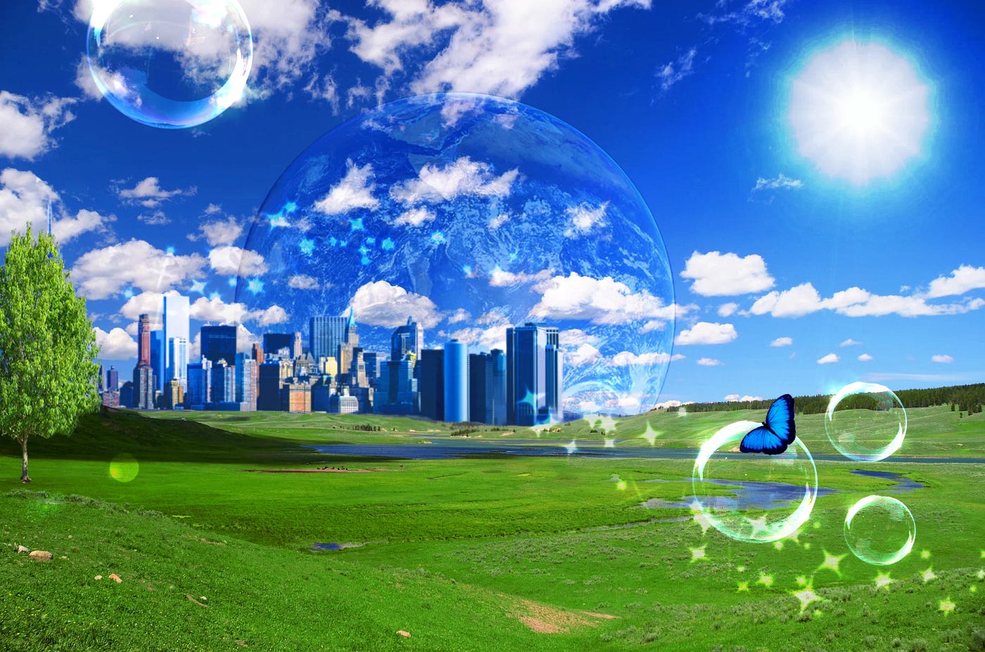
Alongside economic instability, increasing wealth division and a global rise in fascism, it makes sense that the Y2K aesthetic has become a massive trend. In this time of worldwide uncertainty people “want to feel comforted when in the real world they feel uncomfortable” says Paul Greenwood, head of research and insight at the creative agency We Are Social. According to him, people “become nostalgic for the cultural touchstones of their youth” in uncertain times. People are scared, wanting to look back at what used to make them happy. People want to revisit fashion, music or visual styles indicative of a better time.
Former animator and now cultural video essayist, Sarah Davis Baker, made a video titled, ‘The Internet Used to Be a Place’ in 2025. In the video she critically reflects on her own experience with the internet prior to its centralisation towards a few companies. She compares her experience with personal websites, communities, and web rings to the modern online landscape we have today - elaborating on how we got here descriptively. She states that this resurgence of older styles “isn't about aesthetics. It's about craving that sense of place, a feeling of belonging.” That statement really resonated with me and informed my decision for community to be a cornerstone for my E&E zine project.
.

![]()


 .
.![]()
![]()
![]()
![]()
![]()
Although I may have come to repurposing old technologies somewhat accidentally in a video montage, I do really feel as if revisiting old mediums can serve a much larger purpose. In my Unit 6 E&E project I paid homage to and tried to create a safe space for a community through a zine that repurposed old styles. In my N&V project I wanted to use the old Flash web game style to catch young adults’ attention to get them to try reading and detaching from the now treacherous digital landscape. Truthfully, I love working in my own hyper-digital way and have found it effortlessly rewarding to be able to experiment more with it across Unit 6. Coming to the end of this critical report, I think it is safe to say that I want to use my work to bring joy to and shine a light on communal spaces. I want to inspire people to rethink the way they interact with the digital world and, at the very least, remind them that the world is not always so bleak.